Project Description: Logo Design for the Canadian Youth Sports Foundation (CYSF)
Client: Canadian Youth Sports Foundation (CYSF)
Project Type: Logo Design
Services Provided: Branding, Logo Design, Visual Identity
Overview:
NAV Branding partnered with the Canadian Youth Sports Foundation (CYSF) to create a bold, authoritative, and versatile logo that reflects the foundation’s commitment to elevating youth sports in Canada. As an umbrella organization overseeing multiple child brands, including the Canadian Youth Soccer Academy and the Canadian Youth Basketball Club, CYSF needed a logo that would establish a strong, recognizable identity while maintaining the flexibility to represent various sports.
The goal was to design a modern, professional, and trustworthy logo that appeals to parents, athletes, and sports organizations alike. The new logo positions CYSF as a premier leader in Canadian youth sports, conveying credibility, passion, and excellence.
Challenges Identified:
Lack of a Cohesive Identity: Without a distinct logo, CYSF struggled to establish a recognizable and authoritative brand presence.
Need for Versatility: The logo had to be adaptable across various sub-brands, marketing materials, and sports categories.
Conveying Authority & Trust: As a foundation aiming to gain the trust of parents and youth sports organizations, the logo needed to exude credibility and professionalism while maintaining a sense of youthful energy.
Representing Multi-Sport Inclusivity: The logo had to reflect youth sports as a whole rather than favoring a single sport, making universality and neutrality key design factors.
Key Outcomes:
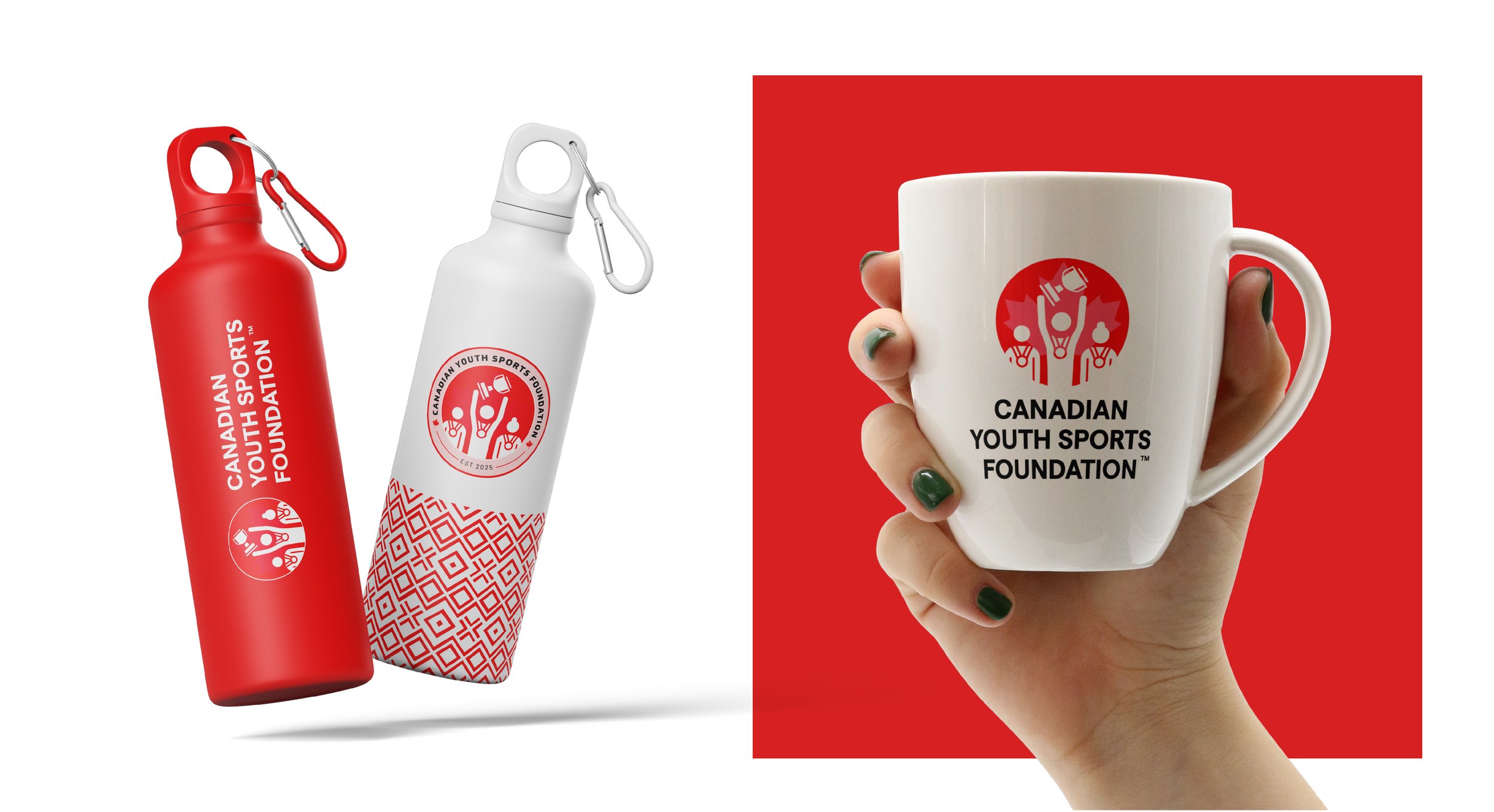
Strong & Symbolic Logo: NAV Branding designed a sleek and dynamic logo that captures the essence of youth sports and national pride. The mark incorporates:
Bold typography with clean, modern lines, symbolizing strength and stability.
A subtle maple leaf motif to represent CYSF’s Canadian roots.
Fluid and dynamic shapes symbolizing movement, progress, and the energy of youth sports.
Color Palette & Symbolism:
The logo features a red and white color scheme, evoking Canada’s national identity while symbolizing passion, determination, and unity.
Neutral accents allow for easy adaptability across CYSF’s child brands.
Versatile & Scalable Design:
The logo was designed to be easily adaptable for various sports categories, ensuring consistency across the foundation and its child brands.
The clean design ensures legibility and visual impact across multiple platforms, including print, digital, and promotional materials.
Authoritative Yet Approachable Aesthetic:
The design strikes a balance between professionalism and accessibility, appealing to both parents and youth athletes.
The bold and contemporary style reinforces CYSF’s credibility as a trusted sports foundation.
Client Impact & Success:
The Canadian Youth Sports Foundation was thrilled with the new logo, praising its modern, bold, and versatile design. The logo successfully communicates CYSF’s authority and leadership in youth sports while maintaining a youthful, energetic appeal.
Since its launch, the logo has become a defining symbol of CYSF’s brand identity, strengthening its presence in the Canadian sports community. It has been effectively applied across marketing materials, digital platforms, and child brands, creating a cohesive and recognizable visual identity.
At NAV Branding, we are proud to have delivered a strong, timeless logo that not only captures the essence of Canadian youth sports but also supports CYSF’s mission of fostering athletic excellence and providing meaningful opportunities for young athletes across the country.


